Project One: Photographer Portfolio Website
Design a portfolio or promotional website for a professional photographer. You may choose any photographer, provided they have a strong, compelling body of work.
This project will be completed using Figma, with Illustrator and Photoshop used as needed for image preparation, brand assets, or supporting graphics.
Since this may be your first formal web design project, our focus will be on creating visual mockups and functioning interactive prototypes. You will not write code for this assignment. Instead, you will concentrate on layout, hierarchy, navigation, responsiveness, and user experience.
You will design both mobile and desktop versions of the site. Start with the recommended photographers list, or propose your own photographer with instructor approval.
Design Considerations
1. Goals & Audience
Before sketching layouts, define:
- The purpose of the site
- The photographer’s goals
- The target audience
- What visitors need to find or understand quickly
Every design decision should support those goals. Do not begin with decoration. Begin with what the site needs to do.
2. Content Definition
Clearly define what content the site will include. On the web, more than in print, content drives structure. Let the photographer’s work guide layout, navigation, pacing, and visual style.
- What sections or pages does the photographer need?
- What work should be featured first?
- How should projects, series, or categories be organized?
- What supporting content is required: biography, exhibitions, clients, press, contact, studio information, or purchasing/licensing details?
Design systems should support the work, not overpower it. A quiet interface may be appropriate for some photographers; a more expressive interface may be appropriate for others. The fit matters.
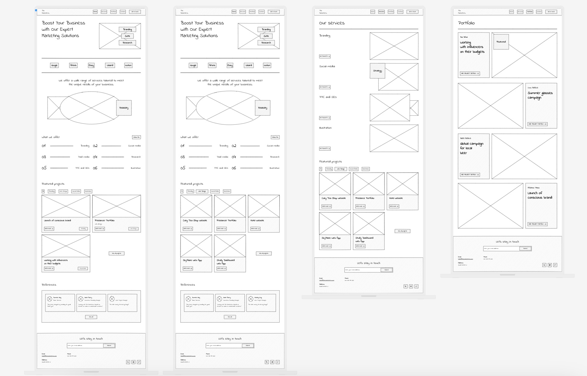
Example planning reference: site maps and information architecture diagrams help make the structure visible before visual design begins.
3. Visual System
Develop a visual system that feels specific to the photographer rather than generic. Consider:
- Typography and type scale
- Color palette
- Grid and spacing system
- Image cropping, sequencing, and rhythm
- Navigation patterns
- Desktop-to-mobile behavior
- The relationship between interface restraint and photographic impact
4. Interaction & Prototype Flow
Your prototype should let someone move through the site as if it were real. Navigation, buttons, galleries, and key page transitions should be connected in Figma. The prototype does not need to simulate every possible interaction, but the primary user journey should be clear.
Project Steps & Milestones
Step One — Information Architecture & Wireframes
Begin by mapping out your site’s structure using sketches and notes. Determine how many pages are needed, what content is most important, and how users will navigate the site. Create low-fidelity wireframes that establish layout and hierarchy before moving into visual design.
Deliverables:
- Photographer research and short rationale
- Goals and audience definition
- Site map or content plan
- Low-fidelity mobile and desktop wireframes
Step Two — Typeface & Color Exploration
Develop three distinct type and color systems. These should reflect different possible directions for the photographer’s brand and will be shared for in-class discussion and critique.
Deliverables:
- Three visual directions
- Typeface pairings and type scale notes
- Color palettes
- Reference examples explaining the intended mood
Step Three — Rough Layouts (Mobile & Desktop)
Build rough layouts for all major pages in both mobile and desktop formats. Create a clickable prototype and test navigation and flow with peers. Record feedback and note usability issues.
Deliverables:
- Mobile layouts
- Desktop layouts
- Clickable Figma prototype
- Peer testing notes
Step Four — Refinement & Feedback
Refine your design based on peer and instructor critique. Improve layout consistency, spacing, typography, hierarchy, and navigation clarity. Prepare your prototype for formal presentation.
Deliverables:
- Revised mobile and desktop layouts
- Improved prototype flow
- Final presentation-ready Figma file
Final Deliverable
A fully clickable Figma prototype including mobile and desktop layouts, ready for in-class critique.
The finished prototype should feel like a plausible website for the photographer, not a generic portfolio template with different images inserted.
Project Timeline
| Step | Focus | Deliverable |
|---|---|---|
| Step One | Structure & planning | IA diagrams and wireframes |
| Step Two | Visual systems | Three type/color directions |
| Step Three | Layout & testing | Rough mobile and desktop prototypes |
| Step Four | Refinement | Polished prototype |
| Final | Presentation | In-class critique |
Project One Schedule — Fall 2026
Project One launches on day one of the semester and runs in parallel with the HTML Resume assignment and the Intro to HTML/CSS unit. Once that unit wraps in mid-September, Project One becomes the sole studio focus through final critique.
Launch (Thu Aug 27)
Focus: Figma workflow, wireframing fundamentals, and information architecture — kicks off alongside the HTML Resume assignment and Intro to HTML/CSS.
- Photographer research
- Goals and audience definition
- Early content inventory
- Project direction questions
Checkpoint 1 (Tue Sep 8)
Focus: Goals, audience, site map, and content hierarchy
- Site mapping
- Content plan
- Page priorities
- Navigation structure
Checkpoint 2 (Tue Sep 15)
Focus: Wireframes, type exploration, and color directions — lands the same day as the HTML Resume critique, marking the shift to full-time Project One studio work.
- Low-fidelity wireframes
- Typography exploration
- Color palettes
- Three visual directions
Target Critique Window (Tue Sep 22)
Focus: Rough layouts, prototyping, and peer testing
- Mobile layouts
- Desktop layouts
- Clickable Figma prototype
- Peer usability testing
Final Critique & Due Date (Thu Oct 1)
Focus: Refinement, accessibility checks, and presentation prep
- Design refinement
- System consistency
- Usability improvements
- Final in-class critique
Final clickable prototype due. In-class presentation and critique.